- #website design
- #cro
- #conversion
- #ux
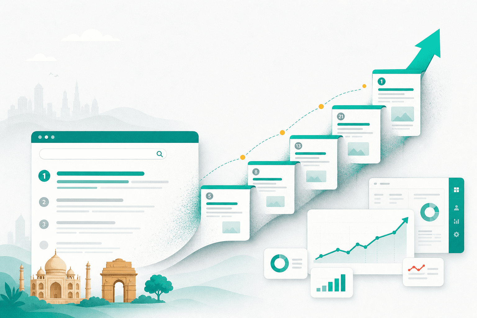
11 website design mistakes that kill conversions in 2026 (and how to fix them in a weekend)
The 11 conversion-killing design mistakes we see most often on Indian business websites in 2026 — with concrete fixes you can ship in a weekend.
We audit 100+ websites a year. The same conversion mistakes show up across industries, regions and budget brackets. Most of them aren't sophisticated UX problems — they're basic things a careful weekend can fix.
This is the list, in rough priority order, with the actual fix for each. If you want a personalised version for your site, run our free audit — it'll surface most of these in 30 seconds.
1. The hero doesn't say what you do
The first 3 seconds on your homepage decide whether the visitor stays. Most heroes fail this test by being:
- Too generic ("Welcome to XYZ — your trusted partner in growth")
- Too internal ("Empowering tomorrow's enterprises with AI-driven solutions")
- Too vague ("Innovation. Quality. Excellence.")
Fix: Your hero should answer "what do you do, for whom, with what proof?" in two lines, in 8th-grade English.
"We help D2C brands in India ship high-converting Shopify stores in 21 days. 40+ launches, ₹100Cr+ in tracked GMV."
Specific. Concrete. Proof attached. Anyone can copy this template.
2. The CTA is "Contact Us" or "Learn More"
These are the conversion-killing words of 2026. Generic CTAs convert at 2-3% on average. Specific, value-driven CTAs convert at 5-12%.
Fix: Replace every generic CTA with one that promises a specific value. Some patterns:
- "Get a free 24-hour SEO audit"
- "Book a 30-minute strategy call"
- "Download the 2026 pricing guide"
- "See how we'd run your account"
The pattern is: [verb] + [specific deliverable] + [time/quantity]. The conversion lift is consistent — usually 30-60% over generic CTAs.
3. The form has too many fields
Every extra field drops form completion by ~10%. Most B2B forms have 7+ fields. They're losing 50% of leads to friction alone.
Fix: Cut your form to the minimum:
- Name + email — for low-intent magnets (audit, ebook, newsletter)
- Name + email + WhatsApp — for medium-intent (proposal, demo)
- Name + email + WhatsApp + a one-line "what do you need?" — for high-intent (custom quote)
Anything beyond that goes in a follow-up conversation. Not on the first form.
4. The site loads in 6+ seconds on mobile
Google's data is clear: every additional second of load time on mobile drops conversion by ~20%. Most Indian business sites we audit load in 4–8 seconds on a 4G phone. That's a 40–60% conversion tax before anyone reads a word.
Fix: The big wins:
- Compress every image to WebP at appropriate dimensions. A 2MB hero JPEG is a crime.
- Lazy-load below-the-fold images.
- Remove unused JavaScript (chat widgets, analytics, marketing tags add up fast).
- Move to modern hosting (Vercel, Netlify, Cloudflare Pages) instead of shared hosting if you're still on Bluehost / GoDaddy.
A weekend of cleanup typically takes a 7-second site to a 2-second site. Your bounce rate will thank you.
5. No proof above the fold
People don't believe what you say about yourself. They believe what other people say about you. Most sites bury social proof in a "Testimonials" section halfway down the page.
Fix: Surface proof in the hero or immediately under it:
- Logo cloud (5-7 recognisable logos, even if "recognisable" means "in your industry")
- A single, real, high-quality testimonial with a face and a title
- A live counter ("47 brands launched", "₹62Cr in tracked revenue")
- A trust badge (Meta partner, Google partner, ISO certification, DPI)
This usually adds 1-2 conversion percentage points by itself.
6. The phone number is hard to find
For local Indian businesses especially, your phone number / WhatsApp number is the conversion mechanism. Hiding it in the footer is leaving money on the table.
Fix:
- Sticky header with phone + WhatsApp on desktop and mobile.
- Tap-to-call enabled on mobile (
<a href="tel:...">). - WhatsApp click-to-chat link with a prefilled message that captures the page they were on.
Make it easier to talk to a human than to leave the site.
7. Stock photography that nobody believes
We see this on 60% of B2B sites: smiling diverse models in suits, laptops on desks in pristine offices, generic "team meeting" shots. Nobody believes any of it.
Fix: Use real photography. Even if it's:
- Phone photos of your actual team
- Behind-the-scenes shots of your office or work
- Real client work (with permission)
- Founder-led video segments
Imperfect and real beats polished and fake every single time. If you can't shoot real photos this month, ship the site with illustrations or solid colours instead.
8. The mobile experience is an afterthought
70%+ of Indian web traffic is mobile in 2026. Yet we audit sites where:
- The hamburger menu has 14 nested levels
- Buttons are 12px tall and unclickable
- Forms render with overlapping fields
- Tables overflow off-screen
- Pop-ups cover the whole screen with no easy close
Fix: Test your site on a real phone, end to end, every time you ship a change. Pretend you're a customer with sausage fingers and patchy 4G. If it doesn't feel right, fix it before you launch.
For thumb-first browsing:
- Buttons ≥ 44px tall
- Body text ≥ 16px
- Forms one column, label above field
- Sticky CTA on long pages
9. No clear next step on every page
Every page should answer: "What does this page want me to do?" If a visitor reaches the bottom of any page and there's no obvious next action, they leave.
Fix: Every page needs:
- One primary CTA that matches the page intent
- One secondary CTA for a softer step
- A link to one related piece of content
Service detail page → Primary: "Get a quote for [service]". Secondary: "WhatsApp us about [service]". Related: "See [related case study]."
10. No FAQs (or hidden ones)
A FAQ section is high-converting, low-effort, and SEO-friendly. Yet half the sites we audit either don't have one or hide it three clicks deep.
Fix: Add a 5-8 question FAQ to every important page (homepage, service pages, pricing, contact). Use real questions you actually get asked — not made-up ones.
Add FAQPage schema while you're at it. Google still rewards FAQ rich results in 2026, and they earn dramatically higher CTR.
11. The pricing page is missing or vague
"Custom quote" / "Contact us for pricing" is the most common pricing page in B2B. It also leaks 60-80% of pricing-curious visitors who would have qualified themselves with even a price band.
Fix: Even if you can't publish exact prices, publish bands and engagement models:
- "Project sprints from ₹2L"
- "Monthly retainers from ₹40k"
- "Custom enterprise from ₹3L/month"
Add what's included at each tier. If your pricing is genuinely too custom, publish a structured "what affects pricing" page so visitors can self-qualify.
For our take, see how we built our pricing page.
The weekend fix list
If you have a weekend and want to move the needle:
- Saturday morning: Rewrite your hero in 2 lines. Add proof underneath.
- Saturday afternoon: Cut every form to the minimum fields. Replace generic CTAs with specific ones.
- Sunday morning: Compress every image, lazy-load below-fold, run our audit and fix the top 5 issues.
- Sunday afternoon: Add a sticky phone + WhatsApp on every page. Test the whole site on your phone.
That's it. You'll typically see a 30-60% lift in form fills within 2-4 weeks.
When to bring in help
If you're past the weekend-fix stage and need a proper conversion-led rebuild, our website design & development service does exactly this — usually in 3-6 weeks for a typical business site, with all the conversion infrastructure (tracking, dashboards, CRM, WhatsApp) wired in by default.
Or if you'd rather start with proof, WhatsApp us and we'll record a 5-minute walkthrough of your current site with our top three conversion picks. No pitch, just useful.
The websites that win in 2026 aren't the prettiest. They're the clearest. Get the fundamentals right and the conversions follow.